Data Dashboards and the Changing Landscape of Data Visualization
Every day, mankind creates 2.5 quintillion bytes of data. The rate of our data production is so great that 90% of the world’s data today was created in the last two years alone. This information flows from many sources; climate sensors, investing algorithms, music videos and social media posts all contribute to the formation of a worldwide data repository of immense volume. Cataloging such a quantity of information, let alone interpreting it, seems an insurmountable task. Even on a smaller scale, sifting through a company’s user data to identifying the interests of a target audience can be a laborious task with great capital costs. However, in the business realm, efficient and accurate data analysis is essential to workflow. It is for this reason that the corporate world is shifting away from traditional methods of data interpretation and toward data visualization and dashboards. Rather than acreage of spreadsheets or a desktop cluttered with order forms, data dashboards display all the essential information in real time in one place. Whether for personal research, board meetings or company-wide collaboration, data dashboards replace the rigors of analysis and presentation with a sleek and accessible platform.
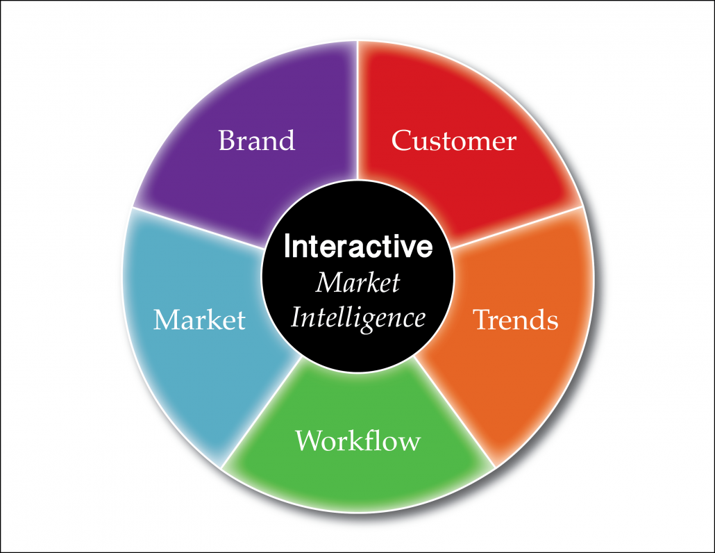
To witness data visualization in action, check our our latest interactive report: The 2016 Market for CRISPR/Cas9


